I have not tried their beer, yet… but I am sure it is great, to be honest I signed up to their newsletter through a social media ad offering ‘Free Beer’, I mean who wouldn’t, right?
But they hit me with this email on February 1st, and I thought it was rather well done.
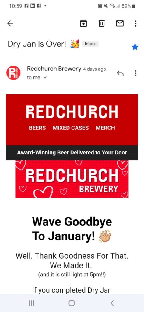
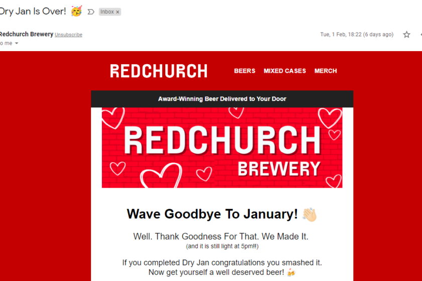
The branded Header Explains clearly what they do
BRANDNAME
BEERS, MIXED CASES, MERCH = 3 Things they do/I might be interested in.
But I was a little confused why there was a second header in the form of the Image that shows me the brand name (again) but with the word Brewery
Are 2 Headers necessary – Couldn’t we just add Brewery to the top header? Also, I feel here by removing this banner image they could have got more text above the fold giving more of an opportunity to hook me, before I needed to scroll.
The email actually looks much better on the desktop view, but still works on Mobile.
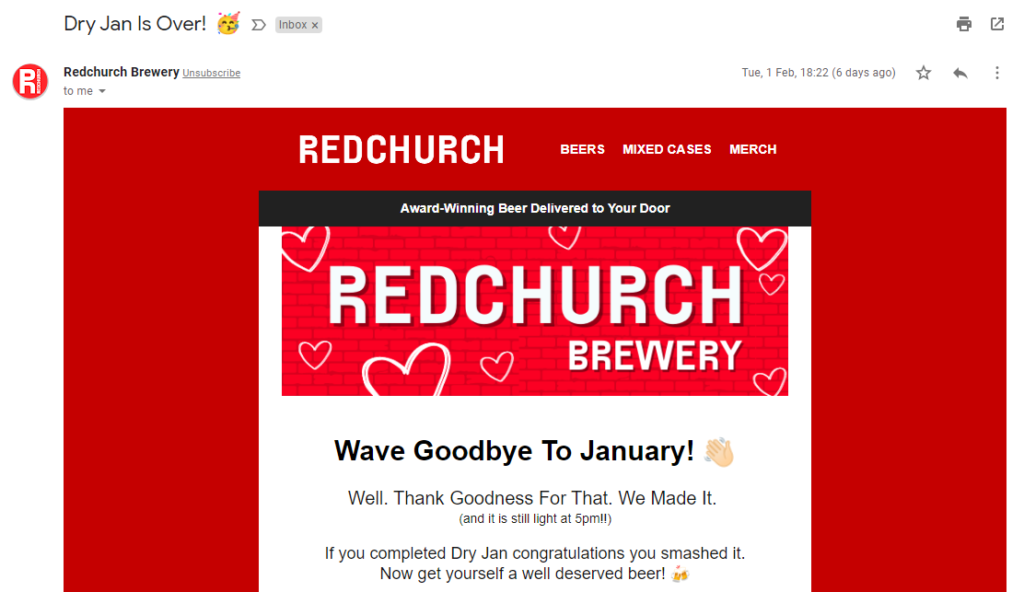
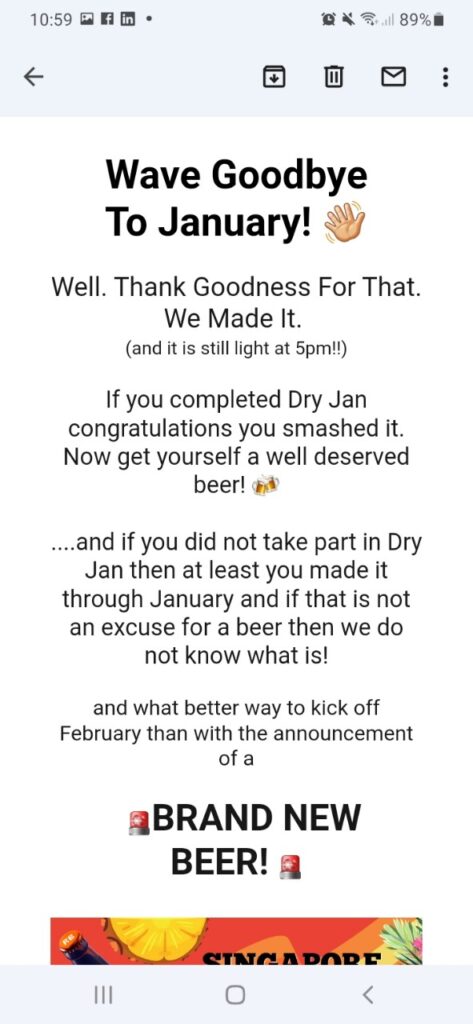
The Subject line ‘Dry Jan is Over!’ A good reason to celebrate… but wait what if I didn’t do ‘Dry January! (guilty!)… Well they covered that too
Truth That… I did a bit of a closer look at this part – I know very poor MS Paint Skills…
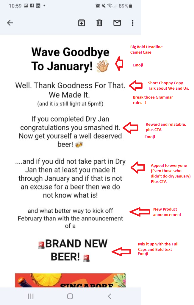
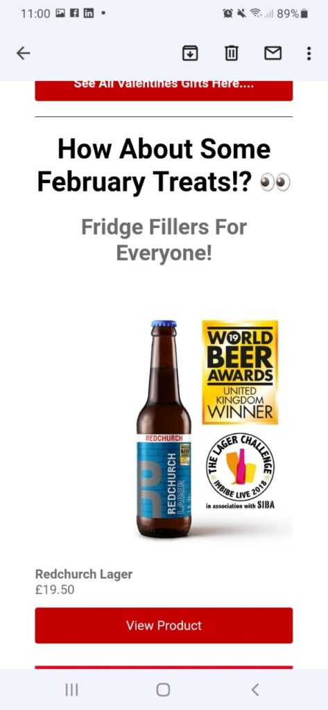
As the email continues it uses the same headline style Big Bold headline. Unconventional Grammar ‘!?’ + Emoji
I used to Hate emoji’s in Emails, but use them sparingly and easily understandable they do add value – and in the Subject line popping an Emoji in the Subject line really makes it POP and cut through the noise of the inbox.
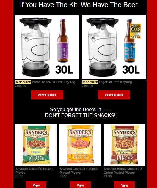
Some monthly offers. Here they mix up the style, now we have contrasting Text on a black background…
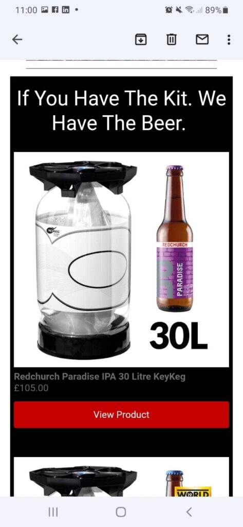
An upsell (I mean it is cheaper than the pub…)
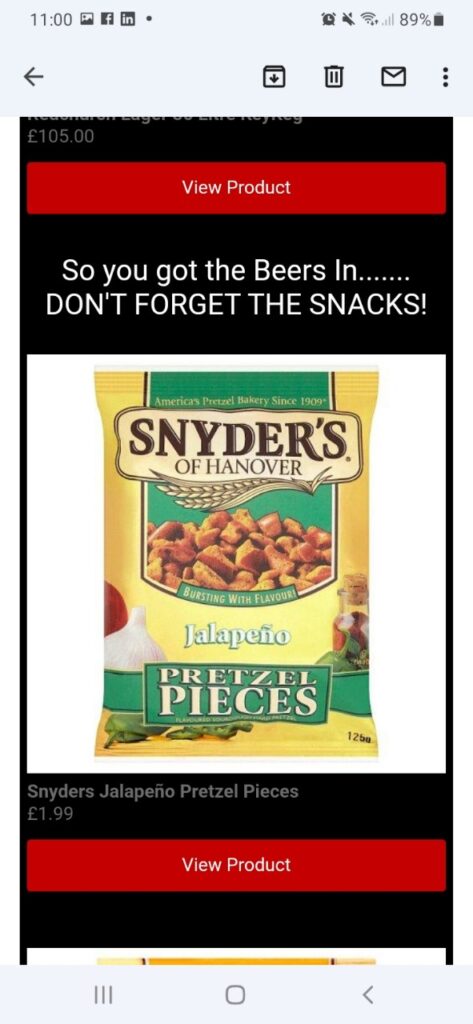
A low-cost up-sell, I have had these Pretzel Pieces and they are pretty awesome!!!
Again here the style changes a bit. Clear ALL CAPS headline. Short easy to understand sentences, to the point.
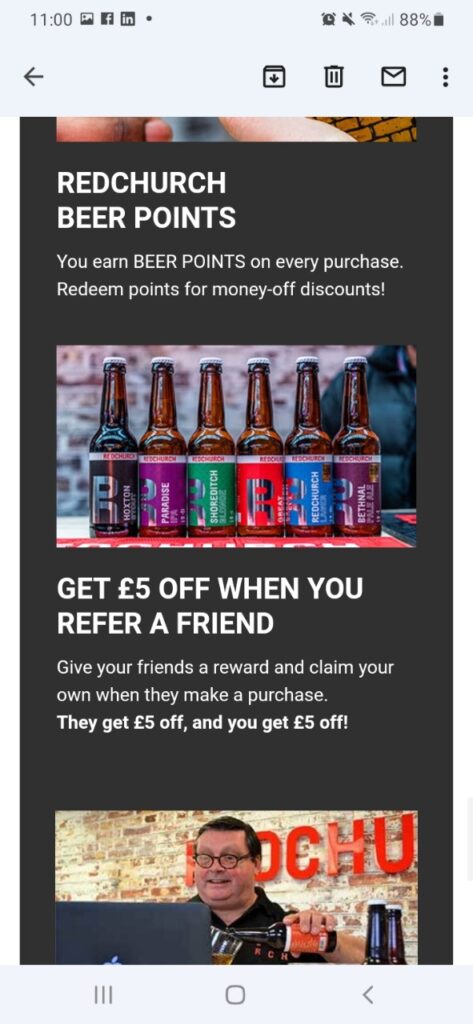
A bonus referral offer
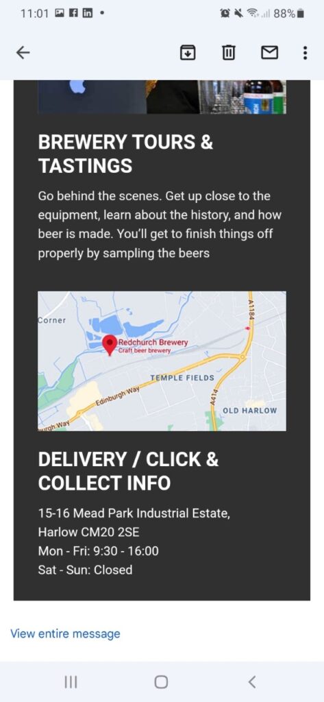
I like this CTA, it is a really personable offer
I just like the flow of this email, it was to the point, Clear, interesting – Both visually and in the copy – Well Done Red Church Brewery!
Here is more of the desktop view
13 Replies to “Redchurch Brewery Jan email”